IDA Language Academy
Educational content, made engaging.
//
Content System
Social Direction
Visual Consistency
Audience Engagement
The academy needed content that could teach, attract and stay recognizable.
The existing communication relied on mixed styles, inconsistent typography and generic visual assets. The page lacked a clear structure for educational content.
The goal was to build a social media system that made language learning easier to read, easier to remember and easier to repeat across formats.
STRUCTURE FIRST
ENTERTAINMENT
SECOND
The content had to stay useful before becoming playful.
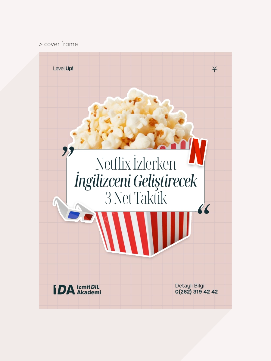
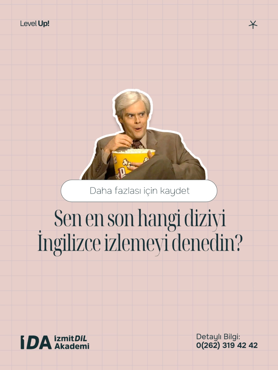
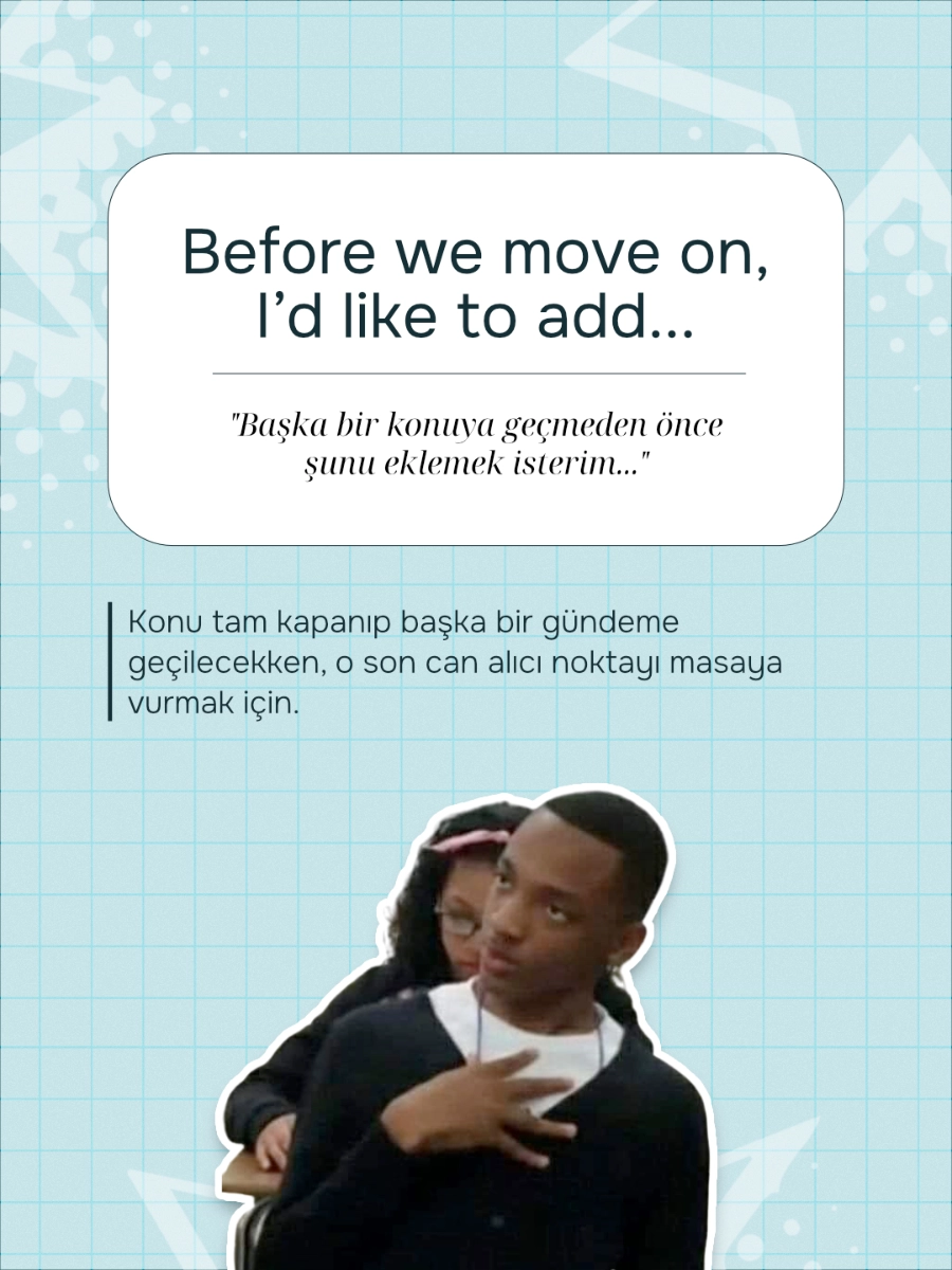
The first frame had to stop the scroll and define the tone. It introduced the topic, established the visual language and led into the learning sequence.
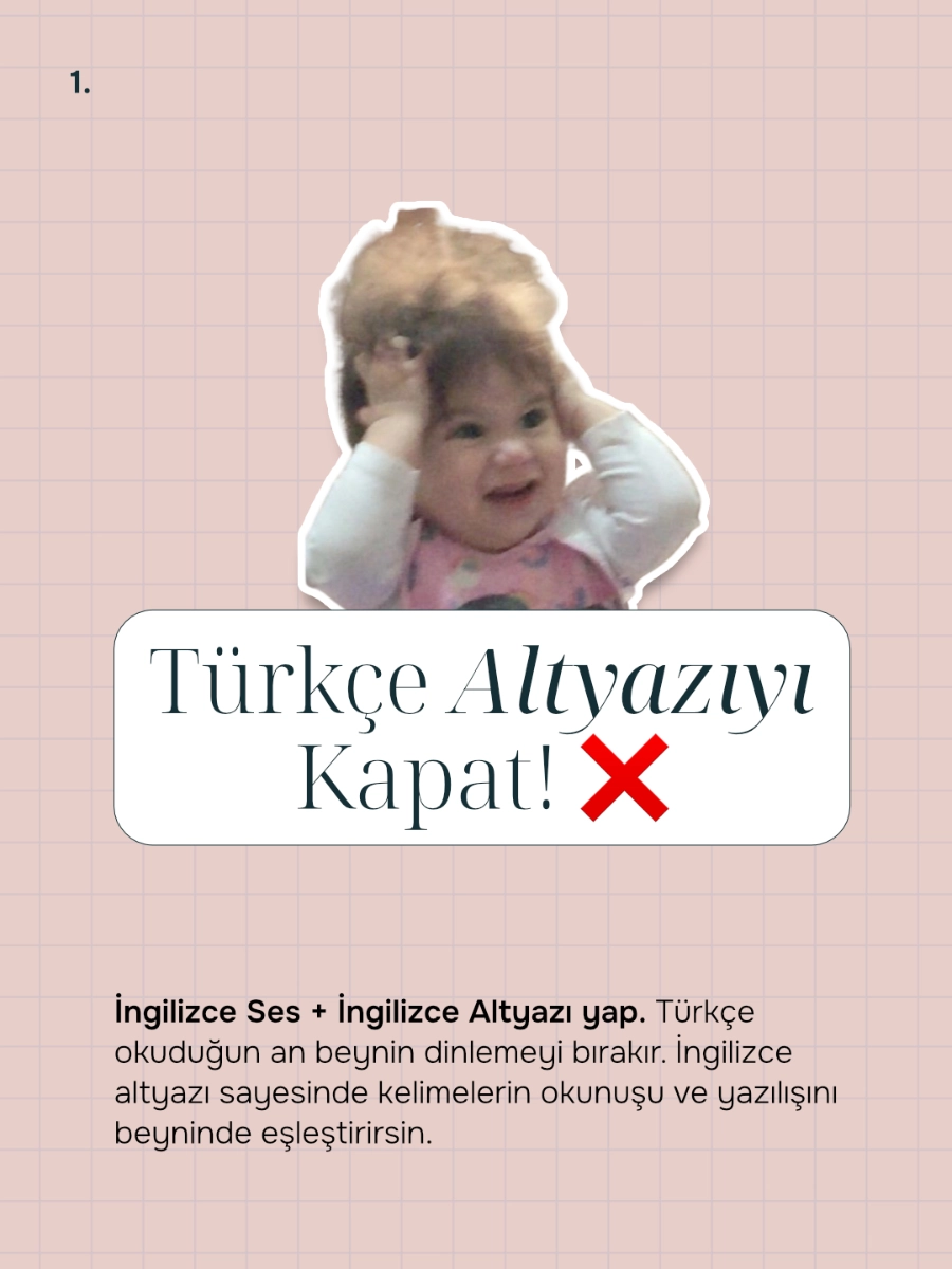
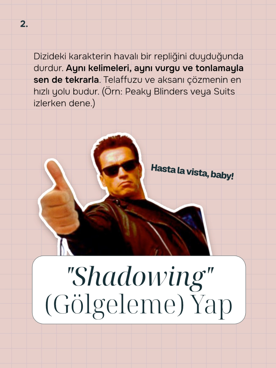
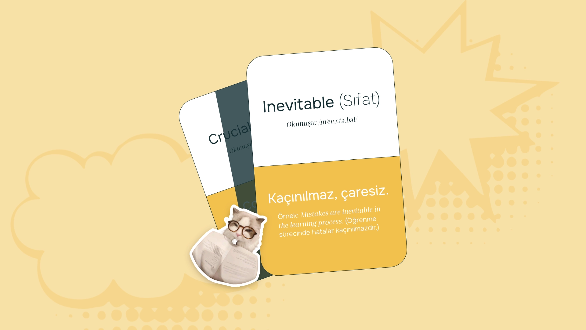
Each carousel was built around a clear learning sequence: hook, explanation, example and response.
Stickers, cutout characters and pop-culture references made the content easier to approach, remember and interact with.
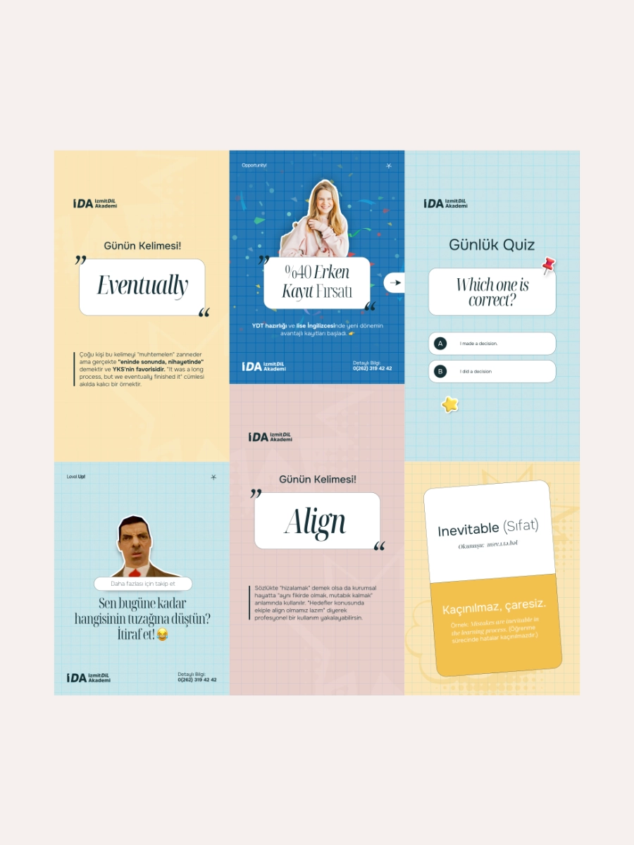
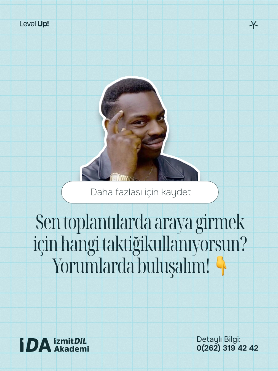
The system needed variety without losing recognition.
Recurring formats were created for vocabulary, phrase correction, quiz stories, pop-culture references and comment based interaction.
Each format kept a clear learning function while using the same visual language: cards, stickers, soft backgrounds and direct prompts.
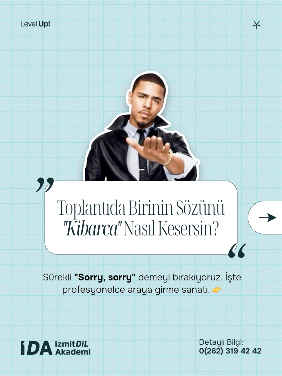
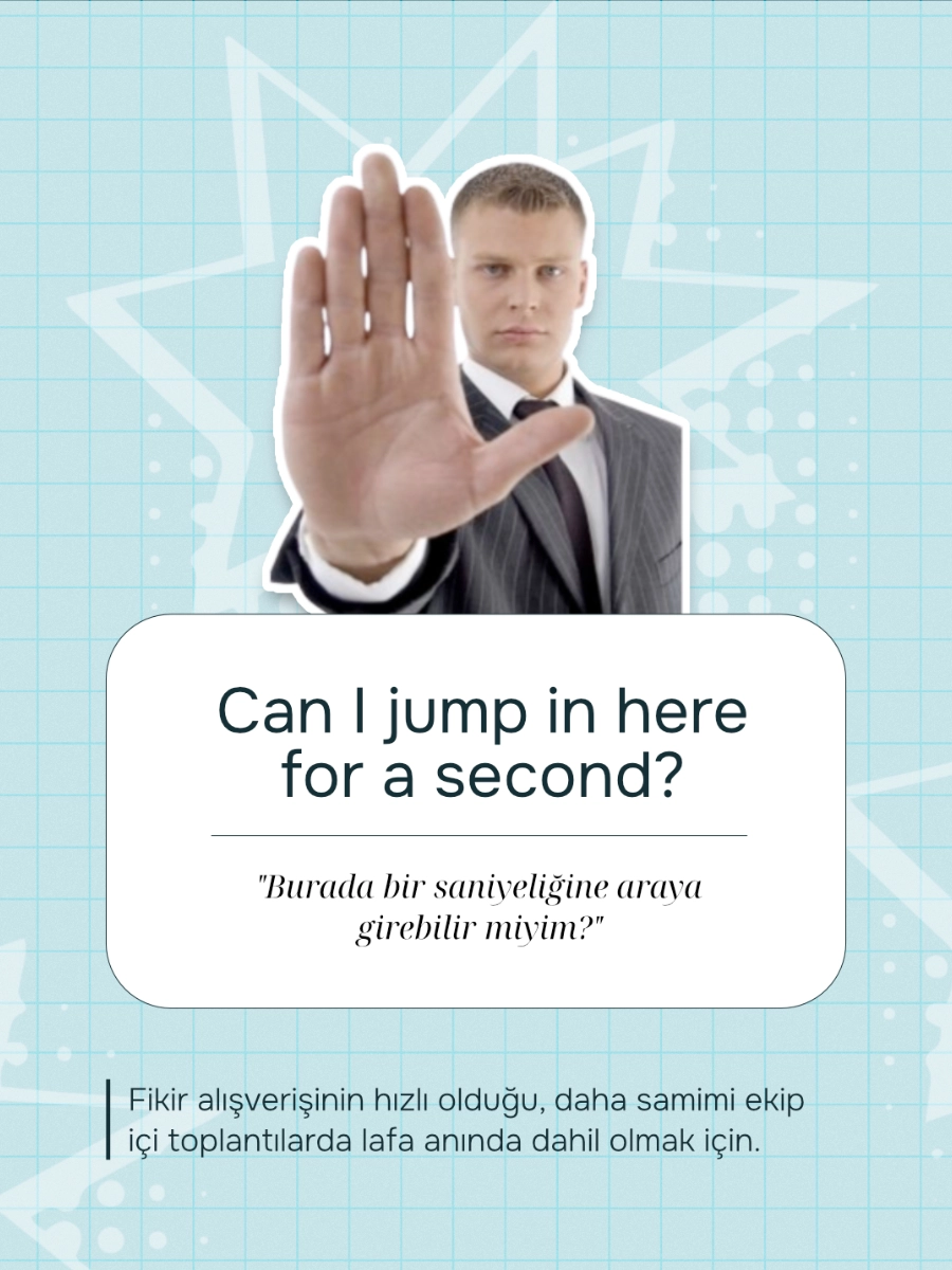
PRACTICAL SPEAKING
FORMATS
Useful language was organized around real speaking situations, not isolated phrases.
Each post introduced one expression through context, making it easier to understand, remember and use in daily conversation.
Content Outcomes
Reusable content formats
- Vocabulary posts, quiz stories, phrase correction, carousel lessons and speaking formats
Stronger page consistency
- The account moved from mixed visual styles to a more recognizable and repeatable structure
Post-project adoption
- The visual direction continued to be used after the handoff
Full content ownership
- Visual style, formats, post ideas, copy direction and recurring story templates were developed during the project